For your eyes only
Logo Options
Two alternative versions of the current logo, both keeping the 250 years framing while the Million Woman March mark stands on its own instead of sitting inside the flag.
Nothing changes until you say so. The logo currently in use across the site is untouched, and this page is not linked anywhere — only you and I can reach it.
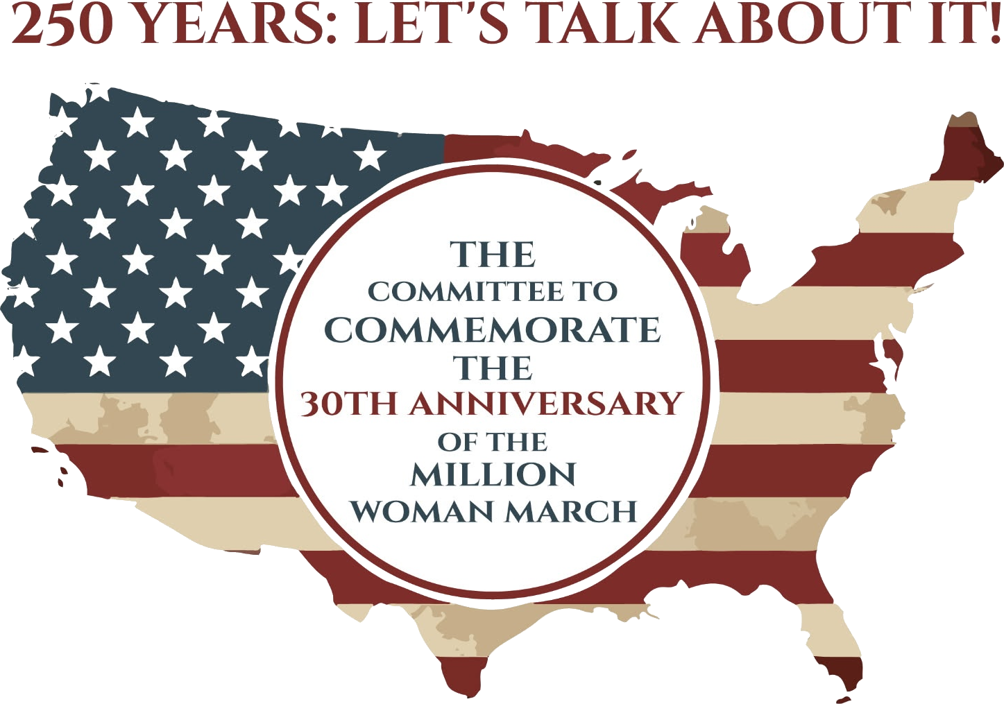
Your current logo
Still in use everywhere on the site. The flag pattern inside the map, exactly as it is today.
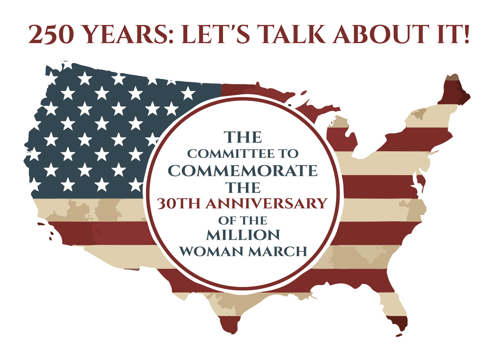
Version A
The map shape and everything else is unchanged, but the flag pattern inside the map is replaced with a clean solid navy fill.
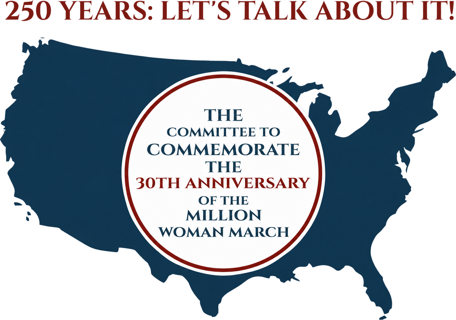
Version B
A flat, clean navy map silhouette with no pattern or texture, the top line slightly smaller, and a thinner border around the anniversary wording so the words carry the design.
Tell me which one feels right. Say “A” or “B” and I’ll carry it across the whole site — or ask me to adjust either one further.